THE INDEPENDENT
APP UX/UI │ B2C │ MEDIA
The Independent News App Redesign
The Problem
The Independent newspaper had just introduced a new premium subscription service for its customers. Although the Independent News app had introduced a few premium elements already, they weren't converting customers as well as they should.
I led the UX review and redesign of the app, with the goal of bringing it in to the modern age, ensuring the premium service was as enticing as it could be for prospective customers and to tighten up any poor customer journeys.
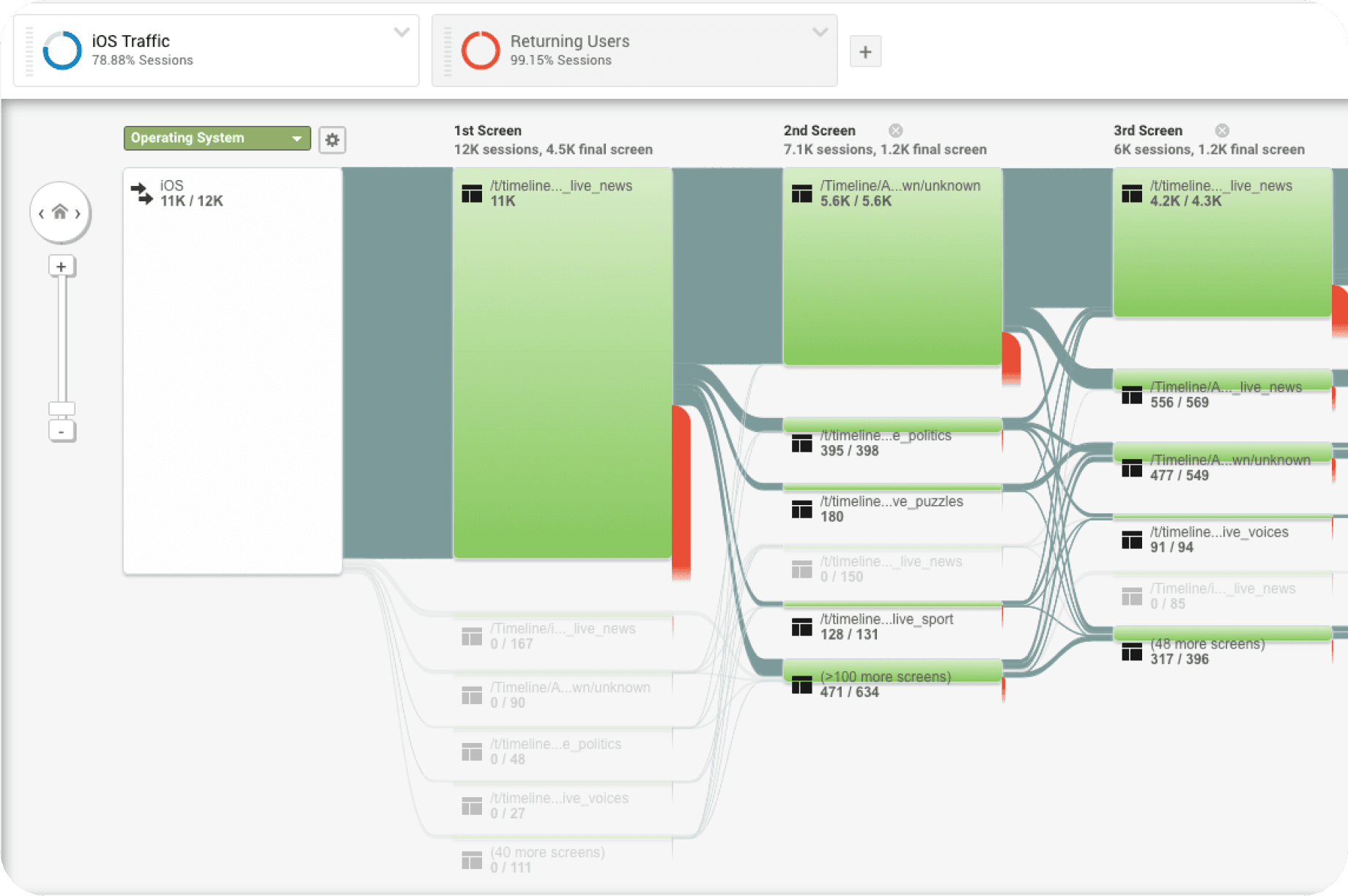
Understanding User Behaviour
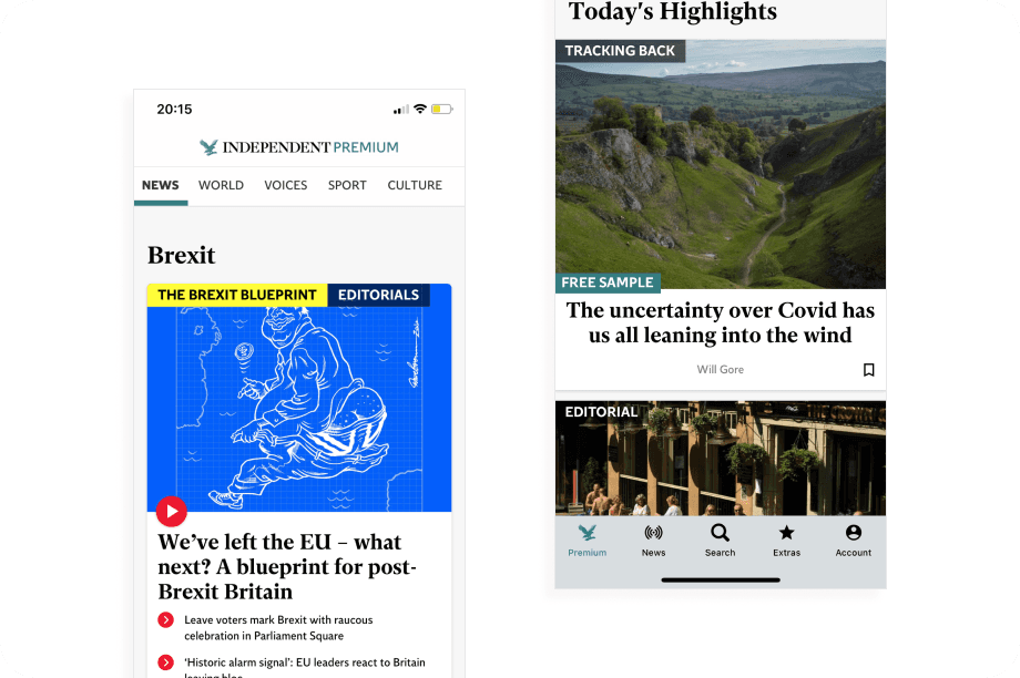
Using Adobe Analytics, I uncovered patterns in user behaviour that underpinned our work. Most notably, we determined we were currently offering too much premium content for free, meaning users could read up to three premium articles a day, reducing the overall value proposition of a subscription.
One of the key problems for us to solve was therefore how to entice premium article views without oversaturating it, all the while ensuring we weren't frustrating non-paying customers, who were still using the app daily.
As we had the resource to undertake a full refresh of the app I also uncovered a number of other pieces of low hanging fruit to tackle. One such example was the convoluted journey for restoring a previously purchased subscription, a process that proved to be highly confusing for users and led to hundreds of customer service emails.
Mapping the Buyer's Journey
To further explore why users weren't converting, I created a detailed buyer’s journey map. This incorporated insights from the App Store, customer service feedback, and user interviews. The map helped us visualise pain points across the conversion funnel and helped us formulate our key hypothesis:
“To increase conversion rates, we need to improve the visibility of premium content within the app, leave users wanting more and clearly differentiate the app offering from the mobile website.”
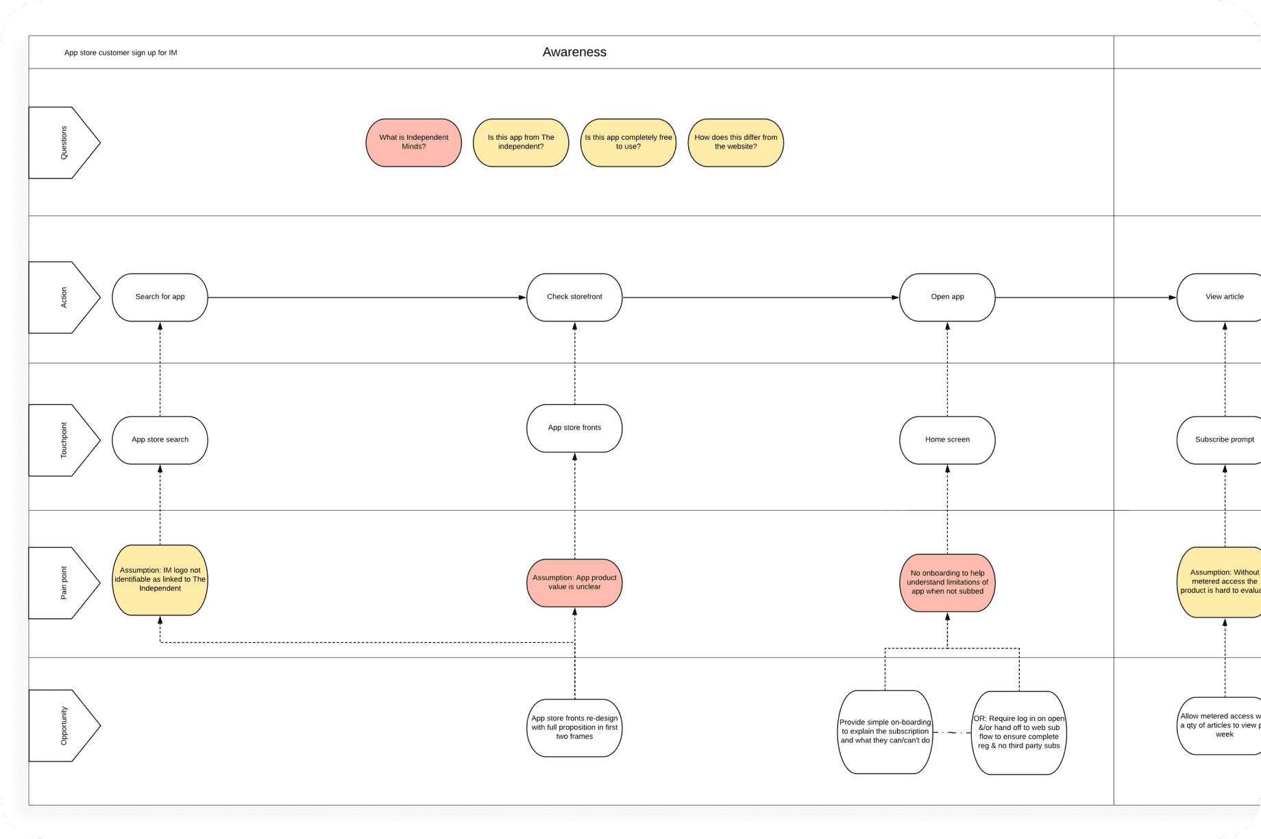
Confusion around the Independent Premium branding and its value proposition was a consistent concern. This was something I felt we could help to tackle through more robust onboarding and clearer signposting/badging throughout the app.
Refining Information Architecture
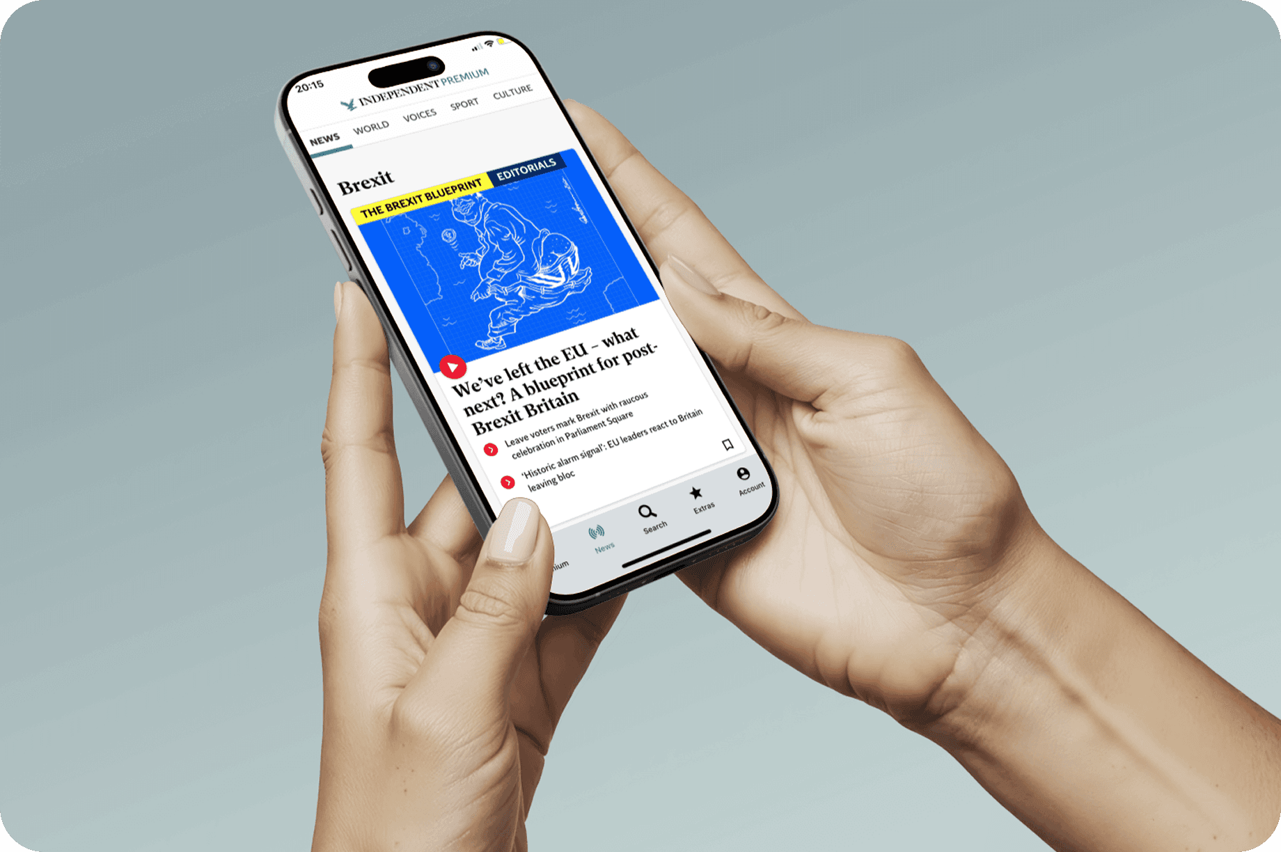
I reorganised the app's information architecture to more prominently promote premium content. One of the key improvements involved separating “Features” (i.e. premium content) from news, creating a clear distinction between the two and creating an enticing entry point.
I proposed adding a sample premium article, which refreshed every few days, which would feature prominently in the features section. This gave users a taste of what premium content could look like, and also a reason to return to the app over the week. Within these premium articles we would then link to related pieces, or articles within a collection, to entice continued reading and the chance of reaching a paywall.
I also grouped together secondary benefits - such as exclusive newsletters or subscriber-only events, into a suite of “Extras”, helping present a more well rounded value proposition that could satisfy users even after they had finished reading articles.
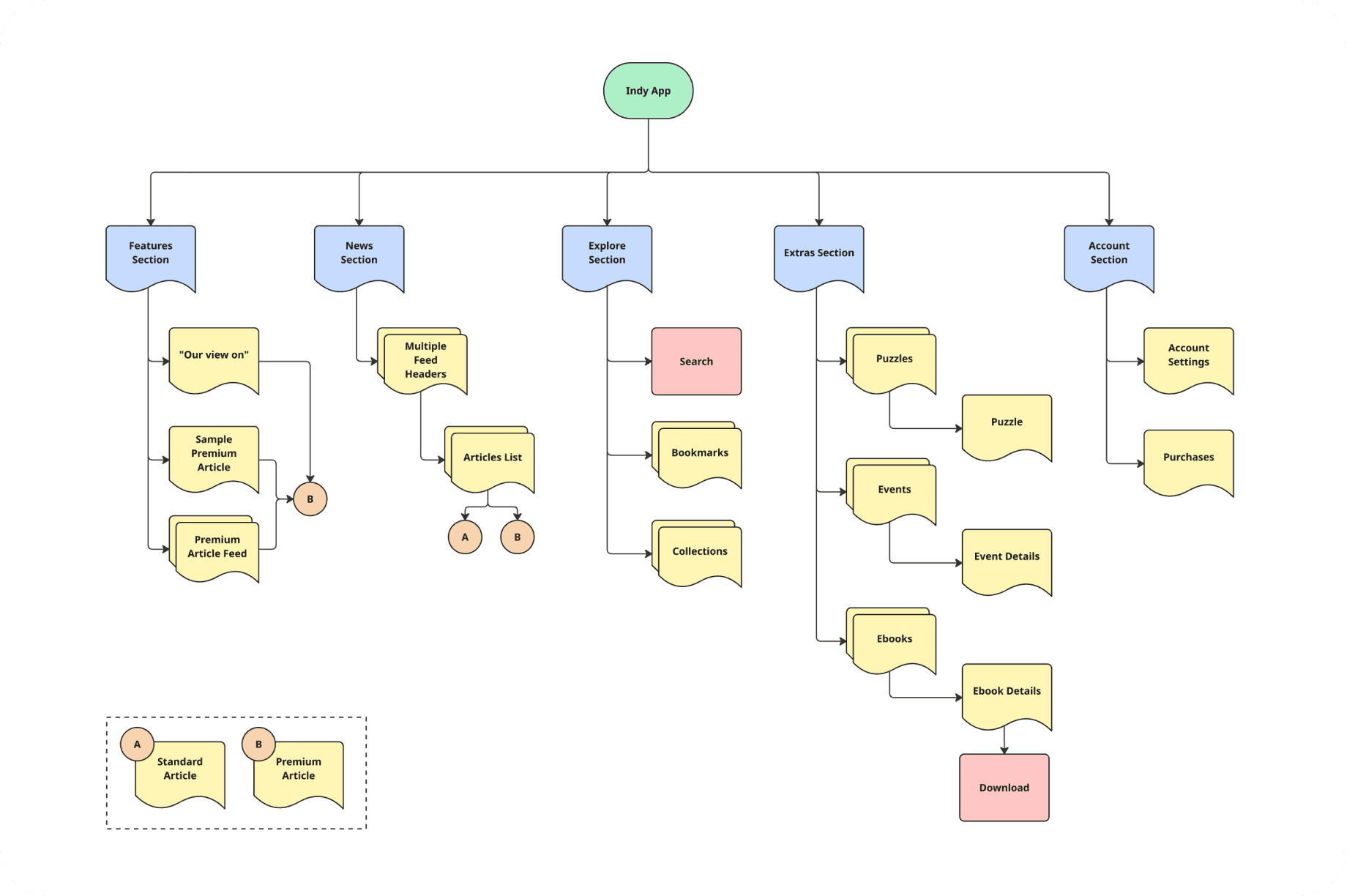
To ensure user expectations were met with the newly proposed architecture, I ran a card sorting exercise with readers to understand where they would intuitively expect to find different content types. The final architecture seen above was driven by these insight, especially the functionality found within the explore section.
Updating User Flows
Beyond the information architecture of the app, the user flows also needed an overhaul. No user flow documentation existed at this point so my first port of call was to create robust user flow diagrams for the app.
As mentioned previously certain flows were not fit for purpose and led to user frustration. The current log in journey, for subscribed users, did not have a forgotten password journey, and there was inadequate error messaging if they ran in to problems.
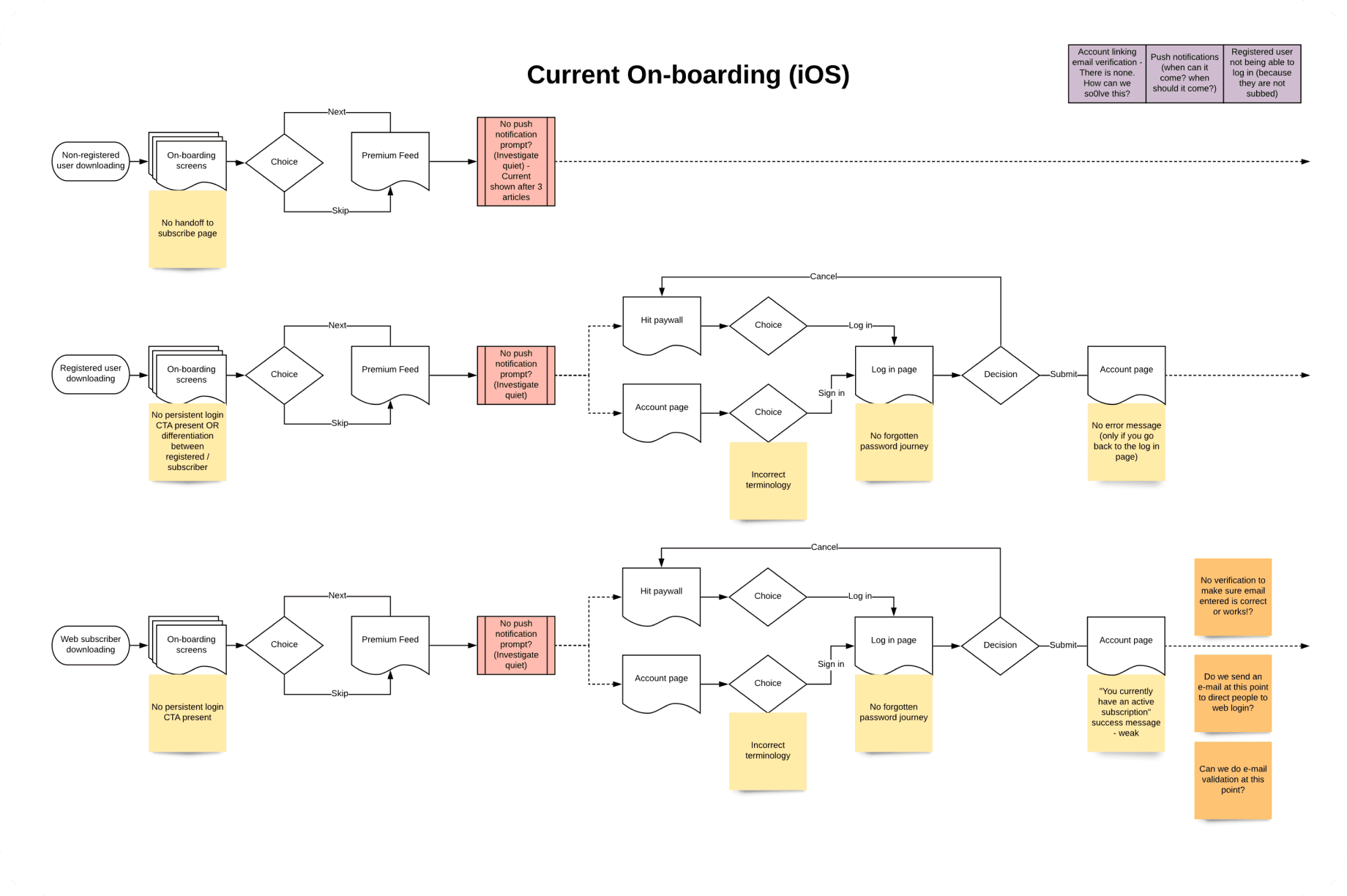
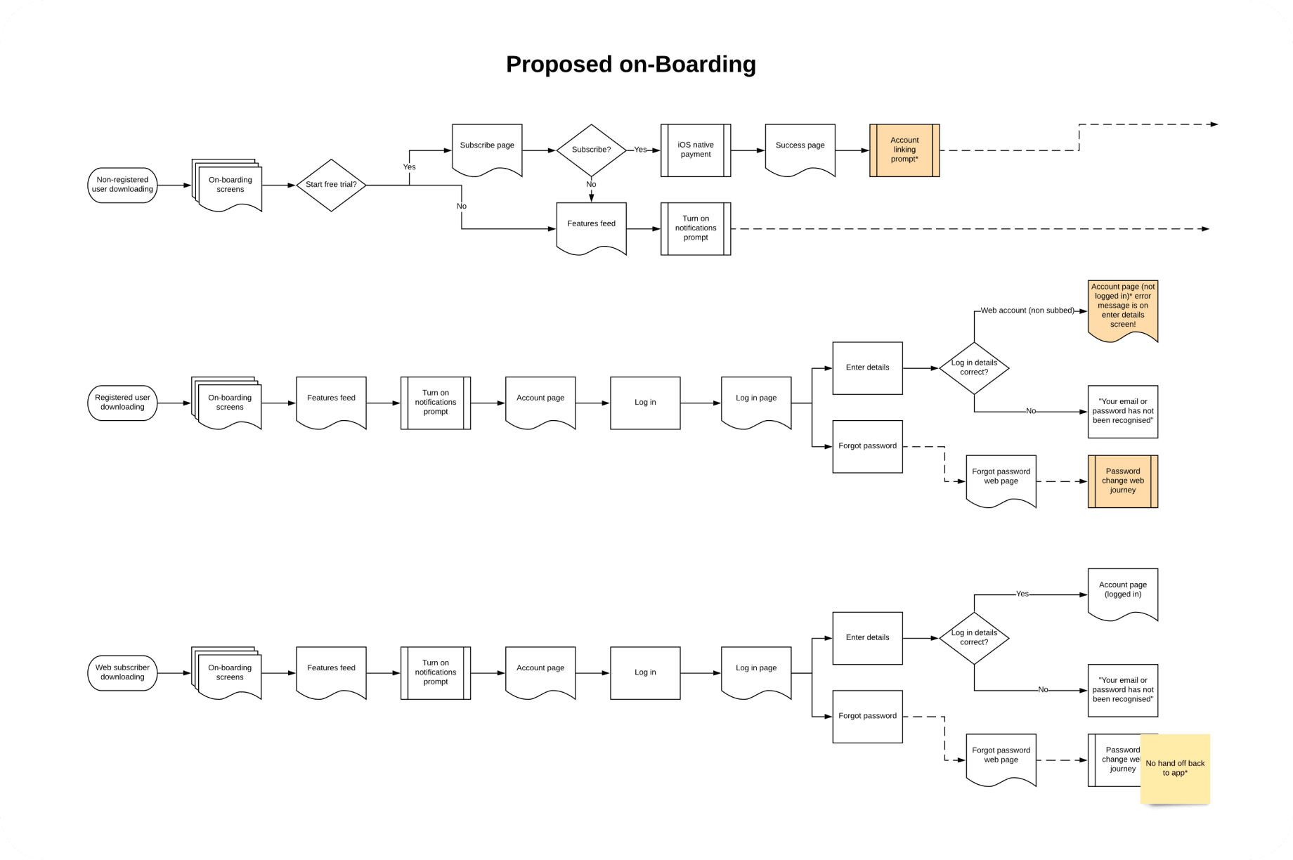
I proposed new user flows for all major journeys for all user types. As well as addressing certain key frustrations of users I also introduced paywall and upsell touch-points at opportune times within the flows. This gave the product team a number of new potential avenues to start optimising conversion prompts.
Wireframing and Prototyping
Once the structure and flows were signed off I created wireframes and built interactive prototypes in InVision. Through these designs we could visualise how new upsell touch-points would look and feel, and how premium branding, such as article badges, could be incorporated throughout.

After multiple rounds of in-person usability testing with The Independent readers, we validated that the updated app was easier to navigate and helped users more clearly understand the value of a subscription, which was our core objective.
UI Design Handoff
I collaborated closely with our UI designer to ensure the visual direction of the app was consistent with the Independent’s brand guidelines. All UI components were built using nested symbols from shared Sketch libraries, following ESI Digital Design System standards, which I had played a large part in building.
This approach not only ensured brand consistency but also allowed for a faster, more efficient design workflow. These libraries continued to support future app iterations.
Supporting Development and Customer Teams
To support UAT and reduce friction during development handoff, I documented user flows for all major app journeys. These diagrams also serve as ongoing references for the customer service and product teams, helping them identify areas for future improvement.
Key Results
iOS App Store rating improved from 3.2 to 4.5
App ranked within the top 25 in the Magazines & Newspapers category
15,000+ downloads to date
Conversion rate increased by 23%