
THE INDEPENDENT
PM │CRO │ B2C │ MEDIA
The Independent Conversion Rate Optimisation
The Independent newspaper was transitioning from a completely ad-based revenue model to one that is supplemented with a new subscription product called Independent Premium.
I was tasked with providing expert UX recommendations and to run a conversion rate optimisation programme. Responsibilities included introducing a suite of new subscription touchpoints, including pop-ups, banners and selling pages.
View Selling Page Figma Prototype
Understanding Current Pain Points
Working closely with the marketing team, I led the redesign of the subscriptions page alongside a parallel programme focused on on-site conversion rate optimisation.
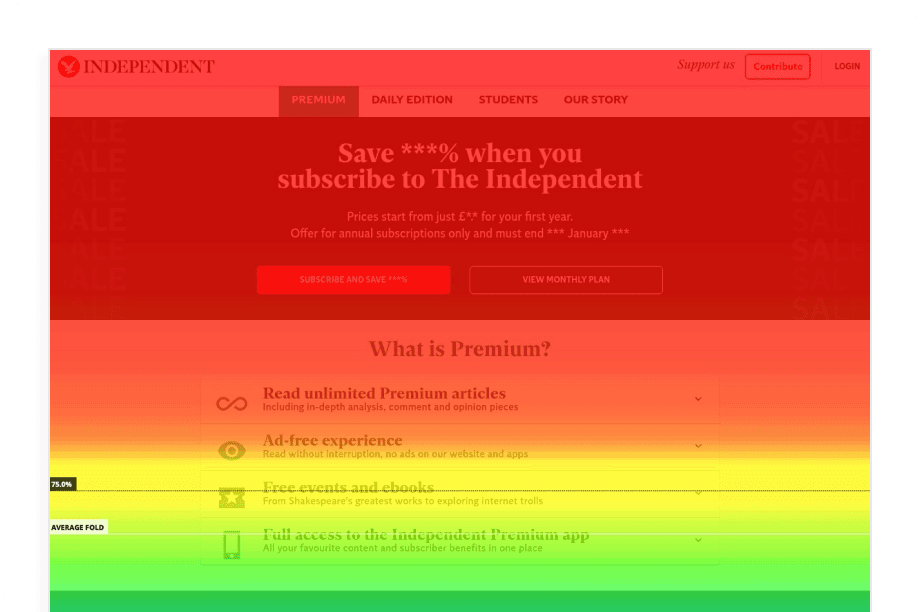
To assess the current page performance, I used Hotjar to examine scroll depth and click hotspots. Two key insights emerged:
Over 75% of users dropped off before reaching the full suite of subscription SKUs
There was a high concentration of clicks on the “View monthly plan” CTA, indicating a desire to compare plans before committing
These behavioural signals suggested a lack of clarity and engagement further down the page, and a need to simplify the decision-making process.
I launched targeted on-site surveys on the subscription page to gather additional insights. Key themes included:
Pricing confusion - users were unclear on final costs after introductory offers
Product differentiation - many struggled to understand the differences between the two SKUs (Premium and Daily Edition), particularly as their benefits overlapped
Using voluntary churn feedback I had previously consolidated into a UX roadmap, I validated our survey data with broader qualitative insights. The roadmap, which ranked issues by volume and complexity (data not shown here due to commercial sensitivity), highlighted two consistent frustrations:
Confusion around SKU differences
Uncertainty over post-offer pricing
These insights confirmed that the current subscription experience lacked clarity and was a key factor in cancellations.
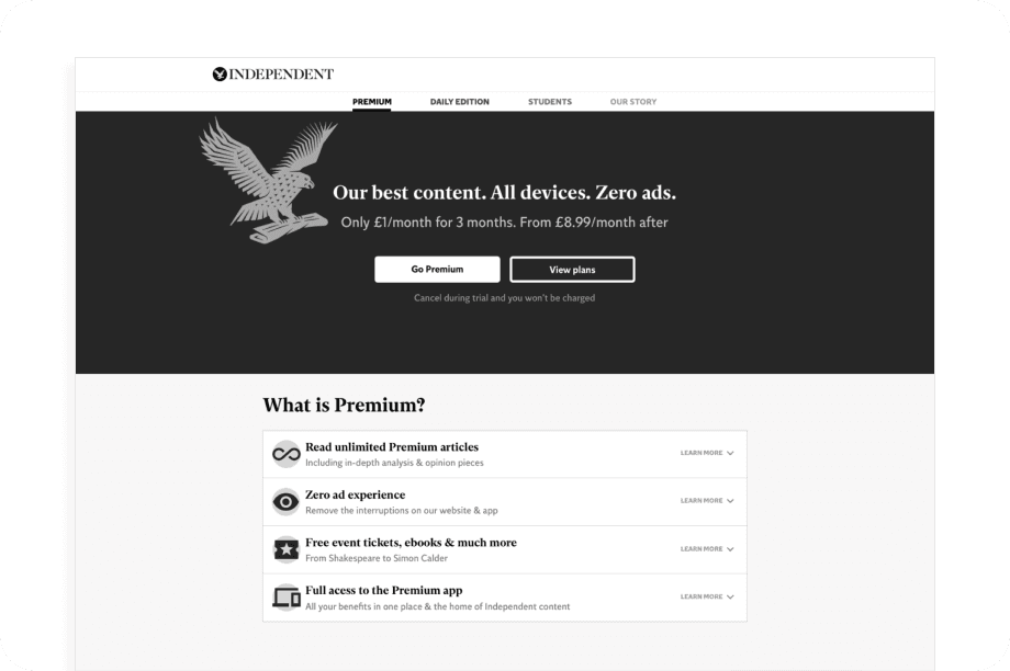
Selling Page Recommendations
I presented the findings to the marketing and editorial teams. Together, we defined several core problem statements to shape the new subscription page:
The page was too long and difficult to digest
The two product SKUs were too similar, causing confusion
We needed to present benefits earlier, more clearly, and in a more compact format
It was agreed to consolidate the two SKUs into a tiered model, simplifying the offering and making value differences more obvious to users.
The new page was to be built within our Piano subscription platform to enable future A/B testing via iFrames. I facilitated a workshop with the marketing team to understand their testing priorities, helping us define which design patterns were future-proof and which wouldn’t scale well.
Initial user testing uncovered a clear performance disparity between desktop and mobile. The previous design had been desktop-first, and mobile users struggled with visibility and interaction. This reinforced the decision to take a mobile-first approach in the redesign.
Initial user testing uncovered a clear performance disparity between desktop and mobile. The previous design had been desktop-first, and mobile users struggled with visibility and interaction. This reinforced the decision to take a mobile-first approach in the redesign.
Design Ideation
During ideation, I explored multiple approaches to:
Surface benefits earlier
Clarify pricing structure
Keep key CTAs above the fold where possible
I developed four design options, each with varying layout hierarchies, and worked closely with stakeholders to understand their alignment with broader business and marketing goals.
The final design combined strengths from both the tabbed and card-based approaches. This hybrid solution performed best in testing across both qualitative feedback and engagement metrics.
I worked closely with internal developers and Piano to validate the feasibility of the design and ensure it met platform constraints.
Touchpoint A/B Testing
In addition to redesigning the subscription page, I optimised on-site subscription prompts - often the first user interaction with our product offering. These A/B tests were run via our subscription platform over two-week cycles using a round-robin format, with winners becoming the new default (BAU).
Where appropriate, we also used Google Optimise to test larger variants outside of the on-site prompt framework.
By improving how we surfaced product value and refining CTA language, we achieved significant gains. One high-exposure prompt saw a +898% increase in conversion rate.
